Google’s May 2020 Core Update: Winners, Winnerers, Winlosers, and Why It’s All Probably Crap
On May 4, Google announced that they were rolling out a new Core Update. By May 7, it appeared that the dust had mostly settled. Here’s an 11-day view from MozCast:

We measured relatively high volatility from May 4-6, with a peak of 112.6° on May 5. Note that the 30-day average temperature prior to May 4 was historically very high (89.3°).
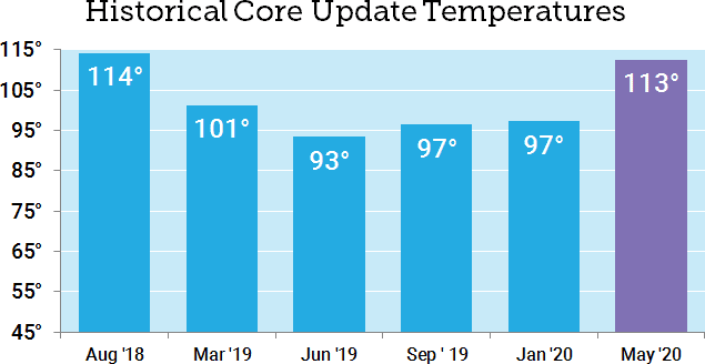
How does this compare to previous Core Updates? With the caveat that recent temperatures have been well above historical averages, the May 2020 Core Update was our second-hottest Core Update so far, coming in just below the August 2018 “Medic” update.
Who “won” the May Core Update?
It’s common to report winners and losers after a major update (and I’ve done it myself), but for a while now I’ve been concerned that these analyses only capture a small window of time. Whenever we compare two fixed points in time, we’re ignoring the natural volatility of search rankings and the inherent differences between keywords.
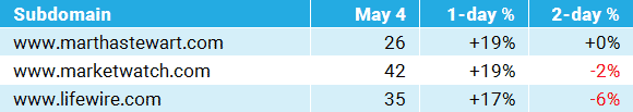
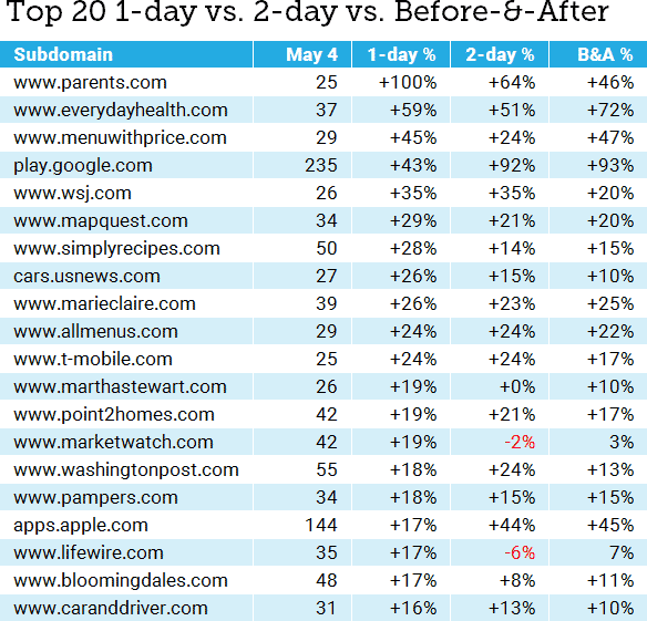
This time around, I’d like to take a hard look at the pitfalls. I’m going to focus on winners. The table below shows the 1-day winners (May 5) by total rankings in the 10,000-keyword MozCast tracking set. I’ve only included subdomains with at least 25 rankings on May 4:
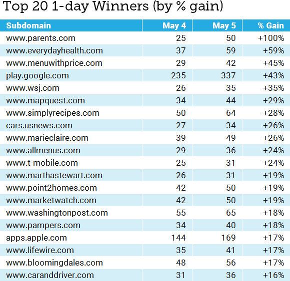
Putting aside the usual statistical suspects (small sample sizes for some keywords, the unique pros and cons of our data set, etc.), what’s the problem with this analysis? Sure, there are different ways to report the “% Gain” (such as absolute change vs. relative percentage), but I’ve reported the absolute numbers honestly and the relative change is accurate.
The problem is that, in rushing to run the numbers after one day, we’ve ignored the reality that most core updates are multi-day (a trend that seemed to continue for the May Core Update, as evidenced by our initial graph). We’ve also failed to account for domains whose rankings might be historically volatile (but more on that in a bit). What if we compare the 1-day and 2-day data?
Which story do we tell?
The table below adds in the 2-day relative percentage gained. I’ve kept the same 25 subdomains and will continue to sort them by the 1-day percentage gained, for consistency:
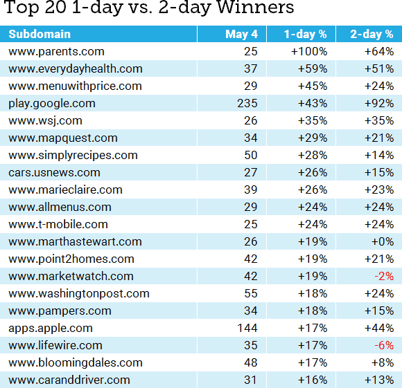
Even just comparing the first two days of the roll-out, we can see that the story is shifting considerably. The problem is: Which story do we tell? Often, we’re not even looking at lists, but anecdotes based on our own clients or cherry-picking data. Consider this story:
If this was our only view of the data, we would probably conclude that the update intensified over the two days, with day two rewarding sites even more. We could even start to craft a story about how demand for apps was growing, or certain news sites were being rewarded. These stories might have a grain of truth, but the fact is that we have no idea from this data alone.
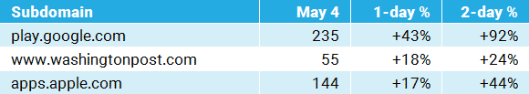
Now, let’s pick three different data points (all of these are from the top 20):
From this limited view, we could conclude that Google decided that the Core Update went wrong and reversed it on day two. We could even conclude that certain news sites were being penalized for some reason. This tells a wildly different story than the first set of anecdotes.
There’s an even weirder story buried in the May 2020 data. Consider this:

How do we define “normal”?
Let’s take a deeper look at the MarketWatch data. Marketwatch gained 19% in the 1-day stats, but lost 2% in the 2-day numbers. The problem here is that we don’t know from these numbers what MarketWatch’s normal SERP flux looks like. Here’s a graph of seven days before and after May 4 (the start of the Core Update):
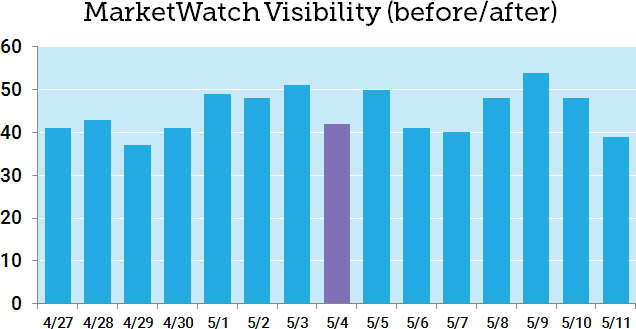
Looking at even a small bit of historical data, we can see that MarketWatch, like most news sites, experiences significant volatility. The “gains” on May 5 are only because of losses on May 4. It turns out that the 7-day mean after May 4 (45.7) is only a slight increase over the 7-day mean before May 4 (44.3), with MarketWatch measuring a modest relative gain of +3.2%.
Now let’s look at Google Play, which appeared to be a clear winner after two days:
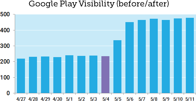
You don’t even need to do the math to spot the difference here. Comparing the 7-day mean before May 4 (232.9) to the 7-day mean after (448.7), Google Play experienced a dramatic +93% relative change after the May Core Update.
How does this 7-day before/after comparison work with the LinkedIn incident? Here’s a graph of the before/after with dotted lines added for the two means:
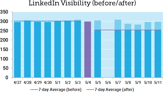
While this approach certainly helps offset the single-day anomaly, we’re still showing a before/after change of -16%, which isn’t really in line with reality. You can see that six of the seven days after the May Core Update were above the 7-day average. Note that LinkedIn also has relatively low volatility over the short-range history.
Why am I rotten-cherry-picking an extreme example where my new metric falls short? I want it to be perfectly clear that no one metric can ever tell the whole story. Even if we accounted for the variance and did statistical testing, we’re still missing a lot of information. A clear before/after difference doesn’t tell us what actually happened, only that there was a change correlated with the timing of the Core Update. That’s useful information, but it still begs further investigation before we jump to sweeping conclusions.
Overall, though, the approach is certainly better than single-day slices. Using the 7-day before-vs-after mean comparison accounts for both historical data and a full seven days after the update. What if we expanded this comparison of 7-day periods to the larger data set? Here’s our original “winners” list with the new numbers:
Obviously, this is a lot to digest in one table, but we can start to see where the before-and-after metric (the relative difference between 7-day means) shows a different picture, in some cases, than either the 1-day or 2-day view. Let’s go ahead and re-build the top 20 based on the before-and-after percentage change:
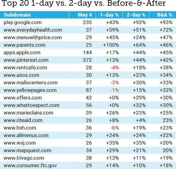
Some of the big players are the same, but we’ve also got some newcomers — including sites that looked like they lost visibility on day one, but have stacked up 2-day and 7-day gains.
Let’s take a quick look at Parents.com, our original big winner (winnerer? winnerest?). Day one showed a massive +100% gain (doubling visibility), but day-two numbers were more modest, and before-and-after gains came in at just under half the day-one gain. Here are the seven days before and after:
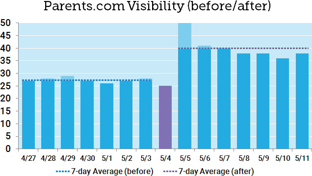
It’s easy to see here that the day-one jump was a short-term anomaly, based in part on a dip on May 4. Comparing the 7-day averages seems to get much closer to the truth. This is a warning not just to algo trackers like myself, but to SEOs who might see that +100% and rush to tell their boss or client. Don’t let good news turn into a promise that you can’t keep.
Why do we keep doing this?
If it seems like I’m calling out the industry, note that I’m squarely in my own crosshairs here. There’s tremendous pressure to publish analyses early, not just because it equates to traffic and links (frankly, it does), but because site owners and SEOs genuinely want answers. As I wrote recently, I think there’s tremendous danger in overinterpreting short-term losses and fixing the wrong things. However, I think there’s also real danger in overstating short-term wins and having the expectation that those gains are permanent. That can lead to equally risky decisions.
Is it all crap? No, I don’t think so, but I think it’s very easy to step off the sidewalk and into the muck after a storm, and at the very least we need to wait for the ground to dry. That’s not easy in a world of Twitter and 24-hour news cycles, but it’s essential to get a multi-day view, especially since so many large algorithm updates roll out over extended periods of time.
Which numbers should we believe? In a sense, all of them, or at least all of the ones we can adequately verify. No single metric is ever going to paint the entire picture, and before you rush off to celebrate being on a winners list, it’s important to take that next step and really understand the historical trends and the context of any victory.
Who wants some free data?
Given the scope of the analysis, I didn’t cover the May 2020 Core Update losers in this post or go past the Top 20, but you can download the raw data here. If you’d like to edit it, please make a copy first. Winners and losers are on separate tabs, and this covers all domains with at least 25 rankings in our MozCast 10K data set on May 4 (just over 400 domains).